React Buttons with the Base + Variant Pattern
Composing React buttons for design systems with the Base and Variant pattern.
Design Systems are made to make the designs consistent across products. But they shouldn’t become a bottleneck for creativity. Some room for experimentation should be present. Let’s see how we can tread this fine line between flexibility and consistency using the base + variant pattern.
Suppose there’s a e-commerce platform with multiple products like the main shopping site, inventory management portal, email system. All of these are customer-facing software so they should reflect a common design language.
For that Sarah will be working on the design system and Ana will be using it in the main shopping site where people buy various products. Sarah figures out that the first priority is to have buttons inside the design system.
The buttons should be flexible enough to fit various product needs but not so much that we risk losing design consistency. When new product requirements come these buttons should be extendable too. If any of these elements are missing then the design systems adaption and impact will be negatively affected.
To accommodate all these requirements Sarah uses the Base + Variant pattern to build the buttons.
Link to this headingBase + Variant Pattern
In the base + variant pattern the core parts of a component that are not subject to change are isolated from the parts that are open to customization.
Things like core behavior are implemented inside the Base component. The Base is private i.e. it’s not meant to be used directly in the application. For each use case, a separate component (Variant) can be built on top of this Base component.
There is a great talk on this by the AirBnB design system team. Check it out once you’re done with this article.
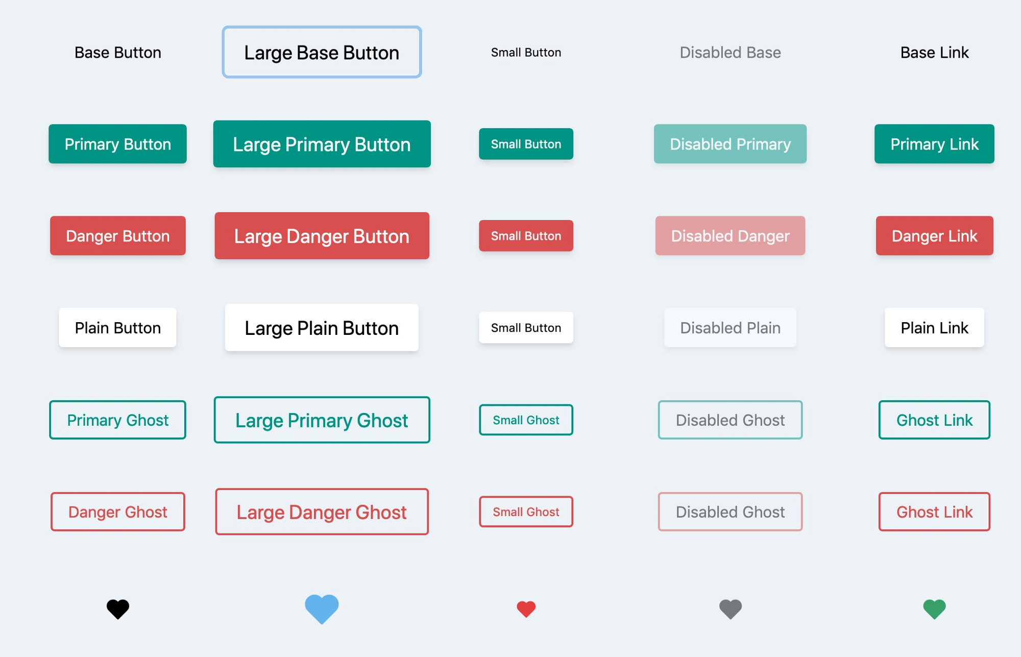
Sarah has categorized the buttons into 3 types —
- Solid buttons can have 3 variants (primary, danger & plain) & 3 sizes (base, large, small) and icons before and after the button text.
- Ghost buttons can have 2 variants (primary & danger) & 3 sizes (base, large, small) and icons before and after the button text.
- Icon buttons don’t have variants for now. Only size customization is supported. A single icon in the center is shown along with a tooltip.
Since Solid button & Ghost buttons have similar structure and core behavior Sarah will make a ButtonBase component first. Then the ButtonSolid & ButtonGhost component can use ButtonBase internally.
Here’s some skeleton code to make these components. The example is in React here but the same concepts can be applied across libraries.
function ButtonBase(props) {const {className,size = 'base',as = 'button', // let Ana render it as a button or an anchor.children,IconStart, // use to render an icon before childrenIconEnd, // use to render an icon after children...restProps} = props;const Element = as;return (<Element{...restProps}// use size, className prop to generate className for this elementclassName="generated-base-classnames"><span>{IconStart}</span>{children}<span>{IconEnd}</span></Element>);}function ButtonSolid(props) {const { variant = 'primary', ...restProps } = props;return (<ButtonBase// all the other props like IconStart will be passed to ButtonBase{...restProps}// use variant to generate className and pass it to ButtonBaseclassName="generated-solid-classnames"/>);}function ButtonGhost(props) {const { variant = 'primary', ...restProps } = props;return (<ButtonBase// all the other props like IconStart will be passed to ButtonBase{...restProps}// use variant to generate className and pass it to ButtonBaseclassName="generated-ghost-classnames"/>);}export function IconButton(props) {const {className,size = 'base',as = 'button', // let Ana render it as a button or an anchor.Icon,tooltip, // button text in tooltip (code not shown)...restProps} = props;const Element = as;return (<Element{...restProps}// use size, className prop to generate className for this elementclassName={`generated-icon-classnames ${className}`}>{Icon}</Element>);}
As you can see IconButton is not using ButtonBase since there is almost nothing common between them. We could make a IconButtonBase and use it in IconButton but it would be an overkill at this point. If need does arise in future then the common parts can be moved from IconButton to IconButtonBase. IconButton will use IconButtonBase and no changes in the product side would be needed.
You can clearly see how many usecases we can address with our implementation. Let’s check how Ana can use them in her product.
Link to this headingPractical Usage
The different type, variant, size of buttons are used to communicate different things to the users. Let’s take the following use cases for buttons as an exercise.
Add to Cart button — Since most users buy multiple items together their main action is to add an item to cart. To make this button the most prominent on the product detail page Ana chooses a Solid button with primary variant.
Buy Now button — This is the second most useful interaction for users. As this is also present on product detail page Sarah recommends to not use the Solid button of primary variant. So instead Ana chooses a Ghost button with primary variant. It’s primary because it’s also a positive action.
Add to Wishlist button. — This can be useful for customers who just want to bookmark an item to buy later. Ana uses a large IconButton here.
Empty Cart button — User can empty the entire cart by clicking on this button. User needs to be slightly aware of buttons which destroy something or delete things. Ana chooses a Ghost button with danger variant for this.
Cancel Order button — User can cancel their entire order by clicking this button. This action will cost money to the company too. So the user should take extra precaution when using this button. To stress this Ana makes this a Solid button with danger variant.
Cancel Confirmation dialog — After user clicks on the Cancel Order button a confirmation dialog is shown. There will be two buttons side by side. As the Confirm button will cancel the order it’s a Solid button with danger variant. The Cancel button is neutral as it’s neither a positive action like buying an item nor a negative action like deleting stuff so it’s a Solid button with plain variant.
Link to this headingComposing Custom Buttons
Suppose Ana has to make a banner for a new super special feature. The banner has a colorful CTA which is meant to gain user attention immediately. None of the existing button variants satisfy the needs of this special CTA.
One approach is that Ana could ask Sarah to make changes in design system components to support this variant. This can lead to many problems. Sarah will need to take care of one more variant which means testing it across products on every release. It also increases the API surface of existing components which can complicate the implementation of the component.
Link to this headingRecommended Approach
The biggest advantage of Base + Variant pattern is that it makes your design system super extendable. In this scenario Ana can make a component let’s say ButtonCustom for her product on top of ButtonBase. This has a couple of advantages —
Since ButtonCustom is part of the product code instead of design system there is no extra maintenance cost on design system team.
ButtonCustom will be built on top of ButtonBase so it is ensured that there is some consistency and best practices baked in.
There will be a lot of room for customization in ButtonCustom. This gives Ana an opportunity to go all out with the new variant’s designs without complicating the design system.
If ButtonCustom breaks it will not affect other buttons in any way. So the issue will be isolated to only one component of only one product.
So we can see that the Base Variant pattern provides us with a lot of design consistency meanwhile being flexible enough to support new variants for future cases.
I’ve built some buttons on this pattern using ReactJS and TailwindCSS. Check it out in this CodeSandbox.
The full source code is available on GitHub.
If you like this article do consider sharing it on Twitter. Your appreciation matters a lot. Also DM me if you're interested in a post about a certain topic, I'll add it to my list!